

Hello creative fellas,
If you've been following me, you must know what I've been working on logos since 2008,
wow just realised that's has been almost 10 years now!
Of course, as many of you, I've started working on small projects, many conceptual and student stuff and no clients.
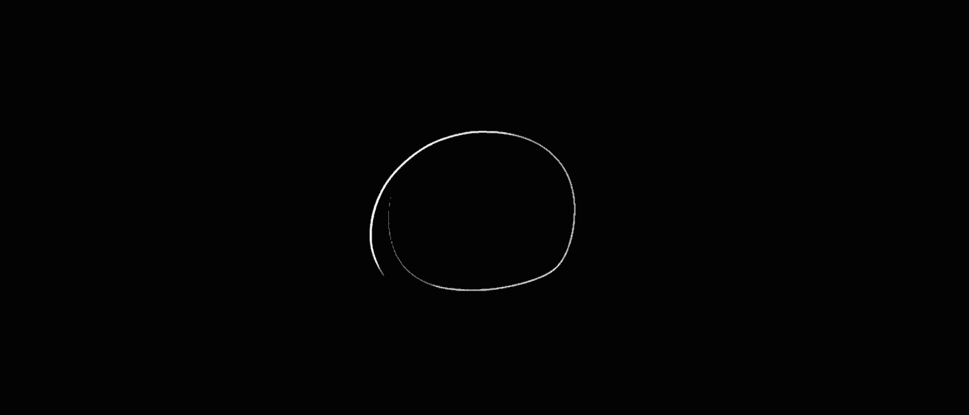
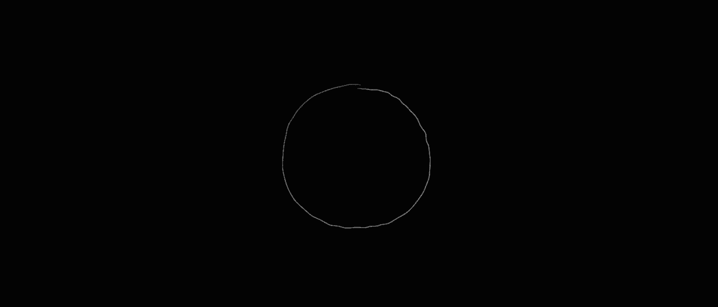
Working with logos I understood after a bunch of experiences (around 2010) that is very important to see the visual progress
of the symbol, as if this timeline was another dimension of the work that is used to be 'behind the scenes', 'making of' stuff
and just get lost or just be something with no value.
So I decided to deliver to clients this dimension of the work instead of a moodboard with some fancy conceptual explanations,
in other words: show a visual path instead of a verbal discourse. This way of working is, no doubt, part of my identity as logo designer and I cannot imagine designing a logo without seeing this logo aspect, this important step that is the path which brings the logo to it's final (or temporary) form.
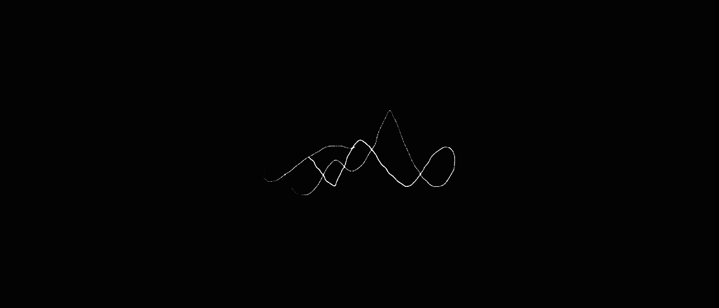
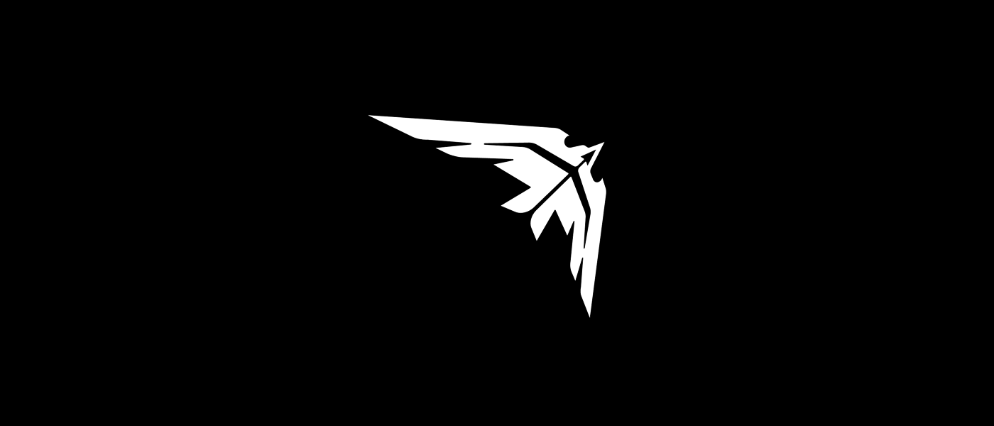
Working on this method I've designed far more than those 101 collection, ones I've selected for your appreciation.
But I think here I could synthesise this line of work with many samples of different logo styles.
I'm asking in advance apologies for the bad quality of the gifs, I know you're more used to the cleanest vector work here
at Behance but for this matter of seeing the evolution of the symbol/concept resolution little matter if compared with the
velocity and intensity that shows these sketches. So, I'm asking: feel free for ad more dimensions to those lines,
If you've been following me, you must know what I've been working on logos since 2008,
wow just realised that's has been almost 10 years now!
Of course, as many of you, I've started working on small projects, many conceptual and student stuff and no clients.
Working with logos I understood after a bunch of experiences (around 2010) that is very important to see the visual progress
of the symbol, as if this timeline was another dimension of the work that is used to be 'behind the scenes', 'making of' stuff
and just get lost or just be something with no value.
So I decided to deliver to clients this dimension of the work instead of a moodboard with some fancy conceptual explanations,
in other words: show a visual path instead of a verbal discourse. This way of working is, no doubt, part of my identity as logo designer and I cannot imagine designing a logo without seeing this logo aspect, this important step that is the path which brings the logo to it's final (or temporary) form.
Working on this method I've designed far more than those 101 collection, ones I've selected for your appreciation.
But I think here I could synthesise this line of work with many samples of different logo styles.
I'm asking in advance apologies for the bad quality of the gifs, I know you're more used to the cleanest vector work here
at Behance but for this matter of seeing the evolution of the symbol/concept resolution little matter if compared with the
velocity and intensity that shows these sketches. So, I'm asking: feel free for ad more dimensions to those lines,
commenting and giving me your feedback and impressions.
I hope you enjoy my last 10 years of logos :)
Sincerely,
BB
I hope you enjoy my last 10 years of logos :)
Sincerely,
BB

*logos marked with the green dot ● are unused,
study or for any reason, available for purchase
study or for any reason, available for purchase

BLACK BULL ●
Feb 20, 2018 - Brasil
touro, ox, horn, logo, negative-space, negro, toro, black, taurus, bull
-
Feb 20, 2018 - Brasil
touro, ox, horn, logo, negative-space, negro, toro, black, taurus, bull
-

FREEDOM GIRL ●
Oct 5, 2017 - Brasil
heart, free, flower, silhouette, beauty, girl, woman, body,
Oct 5, 2017 - Brasil
heart, free, flower, silhouette, beauty, girl, woman, body,
freedom, fly, petal, butterfly
-
-

OCTOPILSEN ●
Feb 23, 2018 - Brasil
charm, spell, poison, label, mollusc, drink, ocean, bottle,
Feb 23, 2018 - Brasil
charm, spell, poison, label, mollusc, drink, ocean, bottle,
pilsen, eight, octopus, beer
-
-

DALMATIAN ●
Feb 21, 2018 - Brasil
croatia, spotted, pinta, white, spots, spot, black, dot, dog, dalmatian, dalmata
Feb 21, 2018 - Brasil
croatia, spotted, pinta, white, spots, spot, black, dot, dog, dalmatian, dalmata
-

DIGITAL SOULMATE ●
Jan 2, 2018 - Brasil
flirt, cupid, soulmate, digital, heart, lovers, match, internet, romance, love, online, dating
Jan 2, 2018 - Brasil
flirt, cupid, soulmate, digital, heart, lovers, match, internet, romance, love, online, dating
SKY FLAVOR
Mar 1, 2018 - Brasil
chocolate, eat, feline, moon, tasty, taste, flavor, stars, sky, cat-

OFFGRID VISION II
Feb 28, 2018 - Italy
Feb 28, 2018 - Italy
earth, fly, wing, tree, free, freedom, hands, fibonacci, butterflies, butterfly, vision, offgrid
-

OFFGRID VISION
Feb 27, 2018 - Italy
Feb 27, 2018 - Italy
fly, wing, tree, free, freedom, hands, heart, butterflies, butterfly, vision, offgrid
-

FLAME HUG
Mar 5, 2018 - Illinois, USA
Mar 5, 2018 - Illinois, USA
fire, bright, hug, care, flame, light, mental-health, support, helping-hands, caring, help, candle
-

SUPPORT DOVE
Mar 5, 2018 - Illinois, USA
Mar 5, 2018 - Illinois, USA
hands, bird, hold, care, fire, flame, mental-health, support, helping-hands, caring, help, dove
-
-

WARM HUG
Mar 4, 2018 - Illinois, USA
Mar 4, 2018 - Illinois, USA
human, help, caring, helping-hands, support, mental-health, fire, candle, care, hug, flame, warm
-
-

SHINE HUG
Mar 4, 2018 - Illinois, USA
shine, bright, hug, care, star, light, mental-health, support, helping-hands, caring, help, human
-

DREAMING ABOUT LOVE ●
Oct 24, 2017 - Brasil
Oct 24, 2017 - Brasil
ying yang, dream, lovely, in love, face to face, bw, cloud 9, cloud, kiss, love, heart, logo
-

MANCHA VERDE
Oct 30, 2017 - Brasil
Oct 30, 2017 - Brasil
somos torcida, sep, palmeiras, mancha, mancha verde
-

PHOENIX SHIELD
Oct 11, 2017 - Arizona, USA
shield, eagle, bird, military, stars, fenix, phoenix
Oct 11, 2017 - Arizona, USA
shield, eagle, bird, military, stars, fenix, phoenix
-

SHUTTER BOUQUET ●
Mar 3, 2017 - France
Mar 3, 2017 - France
floral, shutter, mandala, photography, flower, bouquet, wedding
-

GREEN CROWN ●
Apr 28, 2017 - Sydney, Australia
krone, korona, gold, king, crown, green, app
-

THOUGHT FIRE II
Aug 26, 2016 - Dubai, UAE
beard, think, head, idea, lamp, logo, flame, fire, thought
-

MORFEMA
Mar 24, 2017 - State of Mexico, Mexico
communication, mouth, grow, mountain, wave, mexico, agency, digital, m, morfema
-

MORFEMA II
Mar 28, 2017 - State of Mexico, Mexico
communication, type, grow, pattern, typography, mexico, agency, digital, m, morfema
-

LEXEMA
Apr 11, 2017 - State of Mexico, Mexico
communication, logo, tangram, triangle, mexico, agency, digital, l, lexema
-

LEXEMA II
Apr 3, 2017 - State of Mexico, Mexico
communication, logo, grow, spiral, wind vane, flower, mexico, agency, digital, l, lexema
-

IRVIEN
Feb 14, 2017 - Delhi, India
typography, type, irvien, techhouse, techno, dj, energy, thundeff, bolt
-

HUMANITY CREW
Oct 10, 2016 - Haifa, Israel
mandala, mental healthness, crowd, people, steering wheel, dandelion, crew, humanity
-

LIKE TREE ●
Feb 2, 2017 - Brasil
light, buld, lightbulb, ecofriendly, eco, seed, plant, grow, thumb, like, tree
-

UMBRELLA ●
Jan 31, 2017 - Brasil
animation, logo, cinema4d, rain, umbrella, concept
-

CODED CYCLE ●
Animation by Tanya Matusevich from https://dribbble.com/lemondigital
Animation by Tanya Matusevich from https://dribbble.com/lemondigital
Aug 23, 2016 - Brasil
animation, programming, glyphs, symbols, bike, bicycle, code
-
DIGITECH
Jun 7, 2016 - Dubai, United Arab Emirates
star, windrose, direcional, rec, shutter, eye, parasol, cam, camera, technology, digital
-

GALAXY YOGUI ●
Jul 23, 2015 - New York, USA
logo, central, star, vortex, helix, yoga, yogue, s
-

Q MARK ●
Dec 22, 2014 - California, USA
q, furniture, triangles, polygon, wireframe, backyard, brain
-

SOLV ●
Sep 5, 2014 - Brasil
solve, solutions, solv, logo, loop, animation, gif, cubes
-

BAHIA BEAUTY
Jul 2, 2014 - Bahia, Brasil
b, woman, bahia, brasil, beauty, beach, cosmetics, hair, bay
-

RUN TOWN
Jun 27, 2014 - Sydney, Australia
run, town, city, app, runners, running, network
-

TANGO FRAGRANCE
Jan 13, 2014 - Washington, USA
tango, dancer, fragrance, perfume, wip, gif, dancing
-

INDIGO
Jun 19, 2013 - Bauru, Brasil
bird, lines, logo, gradient, architecture, indigo, blue
-

S GALAXY
Jul 2, 2013 - Milky Way
geometry, logo, generative, galaxy, universe, cosmos, star, flux, vortex, s, sky, triangles
-

CODED SKY
Jul 14, 2013 - Washington, USA
code, hand, catch, window, astronomy, programming, sky, universe,
planets, star, galaxy, space
-

OH, MOON!
Jun 10, 2012 - California, USA
moon, bird, dove, pomba, roots, touch, hands, handshake, moonlight, pieces,
pigeon, fly, earth, air, connection, nature, natural, health
-

DIAMOND SHUTTER
May 28, 2012 - USA
color, facets, photo, photograph, diamond, shutter
-

GRAPHIC NATURE
May 3, 2012 - California, USA
mask, colors, nature, graphic, night, tribal, flames
-

RIVIÈRE
Apr 4, 2012 - São Paulo, Brasil
curly, fashion, style, crowd, real, gold, club, maison, blasion, thread, riviere, chiq
-

MOTION MATH
Mar 25, 2012 - São Paulo, Brasil
motion, math, number, play, playing, number, kids, learn, move, child, school, lesson
-
-
SKIPPING ROPE GIRL
Mar 8, 2012 - North Carolina, USA
jump, logo, mark, girl, rope, pieces, earth, health, protection, prevention, nature, happy, play, process
-

UP
Feb 29, 2012 - Curitiba, Brasil
plane, aviation, grid, flight, courses, commissioner, piloting, up, air, logo, mark
-

ЧУДОМОРЬЕ (Chudomor'ye)
Feb 29, 2012 - Moscow, Russia
folk, brown, creatures, animals, beasts, colors, park, whale, wolf, swan, witch,
cat, sun, rollercoaster, fly, ship, logo, mark, illustrative
-

OH,TREE!
Jun 12, 2012 - California, USA
tree, health, roots, hands, earth, green, eco, natural, nature, sunrise, leafs
-

ES NUTRITION
Feb 21, 2012 - Campo Grande, Brasil
nutrition, e, s, mark, plant, feed, fruit, leaf, purple, monogramme
-

ALSOA
Feb 8, 2012 - Colorado, USA
also, a, globe, position, track, script, type, ship orders, digital
-

ALSOA II
Feb 8, 2012 - Colorado, USA
also, a, globe, position, track, script, type, ship orders, digital
-

ALSOA III
Feb 4, 2012 - Colorado, USA
also, a, globe, position, track, script, type, ship orders, digital
-

FLOWER CLOUD ●
Jan 25, 2012 - California, USA
flower, cloud, petal, computing, nature, app
-

FLORA MUNDI
Jan 3, 2012 - North Carolina, USA
world map, tree, mundi, mondo, mundo, mapa, roots, , international
-

CATCHAFIRE
Jan 10, 2012 - California, USA
fire, first, catch, flame, recruiting, human, resource
-

GROW ENERGY
Oct 25, 2012 - Los Angeles, USA
grow, energy, alga, algae, storm, grid, tutorial, electricity, electric, logo, leaf, thunder, green
-

S FOR SQUIRREL
Sep 1, 2017 - Indore, India
game-design, tail, squirrel, s, icon, game
-

ANCHORED HEART ●
Oct 15, 2012 - Brasil
anchor, love, anchored, docked, grounded, sea, heart, tattoo
-

ACTIVE WEAR
Oct 12, 2012 - USA
active, woman, women, wear, clothes, fitness, yoga, running, sports, girl, blond
-

FITPLUG
Sep 18, 2012 - USA
pug, puppy, dog, plug, wire, unplug, live, fitness, fit, exercise,
manage, time, goals, motivate
-

PRISMATIC IDEAS
Aug 10, 2012 - Bulgaria
prismatic, web design, development, prism, poly, polygon, lightbulb,
balloon, ideas, facet, logo, mark, blue
-

THE TICKET FAIRY
Aug 2, 2012 - United Kingdom
wand, dashed, gif, process, tickets, fairy, butterfly, magic, stars, sparkles, colors, wings, bright
-

THE TICKET FAIRY II
Jun 21, 2012 - United Kingdom
fairy, ticket, magic, woman, star, wings, logo, wandy, colors
-

THE TICKET FAIRY III
Jun 15, 2012 - United Kingdom
tickets, fairy, butterfly, magic, stars, sparkles, colors, wings, bright
-

OXIPIRA
Oct 13, 2011 - Piracicaba, Brasil
river, fish, cut, pira, oxi, machinery, steel
-

OWNAGE
Oct 13, 2011 - Hong Kong
ownage, own, age, action, figures, cg, game, gamers, art, puzzles, toys, toy-art
-

MANDUCA II
Oct 6, 2011 - Brasil
leaf, wood, hotel, nature, restaurant
-

MANDUCA
Oct 6, 2011 - Brasil
leaf, wood, hotel, nature, restaurant
-

ANNA’S CHOICE
Mar 19, 2011 - Denmark
tea, anna, choice, classy, ornamental, woman, coffee, shop
-

CAMRIG
Oct 2, 2011 - USA
cam, camera, point of view, pov, kitesurfing, xtreme, sports
-

CAMRIG II
Oct 2, 2011 - USA
cam, camera, point of view, pov, kitesurfing, xtreme, sports
-

CAMRIG III
Oct 2, 2011 - USA
cam, camera, point of view, pov, kitesurfing, xtreme, sports
-

OXIPIRA II
Sep 19, 2011 - Piracicaba, Brasil
river, fish, cut, pira, oxi, machinery, steel
-

MARCO
Sep 16, 2011 - USA
M, moustache, symmetry, marco, mark, leaves, leaf
-

OXIPIRA III
Sep 13, 2011 - Piracicaba, Brasil
river, fish, cut, pira, oxi, machinery, steel
-

NIGHTLY ADVENTURES
Dec 8, 2011 - USA
owl, beast, night, nightly, ventures, app
-

BAR DA ÁRVORE
Dec 4, 2011 - Paraguaçu Paulista, Brasil
árvore, tree, people, crowd, family, happiness, party
-

CATCHAFIRE II
Nov 22, 2011 - California, USA
fire, first, catch, flame, recruiting, human, resource
-

CATCHAFIRE III
Nov 18, 2011 - California, USA
fire, first, catch, flame, recruiting, human, resource
-

BRANCOM
Nov 11, 2011 - Netherlands
communication, agency, branding, brand, bureau
-

OWNAGE II
Nov 10, 2011 - Hong Kong
ownage, own, age, action, figures, cg, game, gamers, art, puzzles, toys, toy-art
-

AQUILA II
Oct 24, 2011 - Berlin, Germany
eagle, wings, flight, liaison, management, handshake
-

AQUILA
Oct 23, 2011 - Berlin, Germany
eagle, wings, flight, liaison, management, handshake
-

FLIGHT
Dec 27, 2017 - Washington, USA
blue, fly, view, trip, travel, wing, plane, sky, window, airplane, flight, f
-

LOVELY HUG ●
Dec 24, 2015 - Paraguaçu Paulista, Brasil
negative space, xmas, christmas, red, smile, heart, love, lovely, hug
-
ASPIRIS II
Jun 27, 2015 - Delhi, India
marketplace, cannabis, marijuana, aspire, process, wip, logo
-

ASPIRIS
Jun 25, 2015 - Delhi, India
marketplace, cannabis, marijuana, aspire, process, wip, logo
-

AYÓ FILMES
Dec 7, 2016 - Rio de Janeiro, Brasil
logo, flower, tulip, photo, photography, film, shutter
-
LINE DRAGONFLY ●
May 11, 2016 - Bauru, Brasil
insect, wing, simple, linework, dragonfly
-

SANTA SELFIE ●
Dec 4, 2016 - Rio de Janeiro, Brasil
phone, christmas, xmas, cap, logo, bw, negative space, gift, ride, selfie, santa, bike
-

BRAINWAVE SCIENCE
Apr 1, 2016 - Ohio, USA
wip, lie, truth, wave, science, brain, brain fingerprinting, dna
-

BRAINWAVE SCIENCE II
Apr 6, 2016 - Ohio, USA
wip, lie, truth, wave, science, brain, brain fingerprinting, dna
-

I HEARTEA ●
Dec 12, 2016 - Brasil
warm, hands, sprout, love, heart, cup, tea
-

DOGGO ●
Feb 24, 2016 - Rio Claro, Brasil
grid, circular, fibonacci, golden ratio, geometry, dog
-

ELEFINITY
Mar 2, 2016 - Texas, USA
family, negative space, life, cycle, infinity, parenthood, elephant
-
FUNDOS DE GARRAFA
Aug 29, 2016 - Assis, Brasil
lumnete, telescope, recycle, star, bottom, bottle
-
HUMANITY CREW II
Sep 13, 2016 - Haifa, Israel
humanity, health, mental, sky, sea, refugees, syria, fly, wings, paper boat, boat, dove
-
MUSIC SMILE ●
Aug 18, 2014 - Florida, USA
music, piano, smile, teeth, dental, braces, musical
-

PAX GESTURE ●
Jan 3, 2017 - Paraguaçu Paulista, Brasil
feather, gesture, fly, wings, bird, pax, dove, hands, peace
-

POLYAMORY HEART ●
Aug 19, 2014 - Brasil
polyamory, logo, concept, heart, love, animation
-

THE ALMIGHTY MAN
Nov 25, 2016 - São Paulo, Brasil
colors, crown, keyboard, creation, power, rock, man, experimental, music, almighty
-

THOUGHT FIRE
Sep 13, 2011 - Dubai, UAE
beard, think, head, idea, lamp, logo, flame, fire, thought
-
OXIPIRA IV
Oct 3, 2011 - Piracicaba, Brasil
river, fish, cut, pira, oxi, machinery, steel, facility
-

SKULL BUTTERFLY ●
Oct 19, 2012 - Brasil
caveira, skull, logo, butterfly, negative space, bone, concept
-


